Location
Role
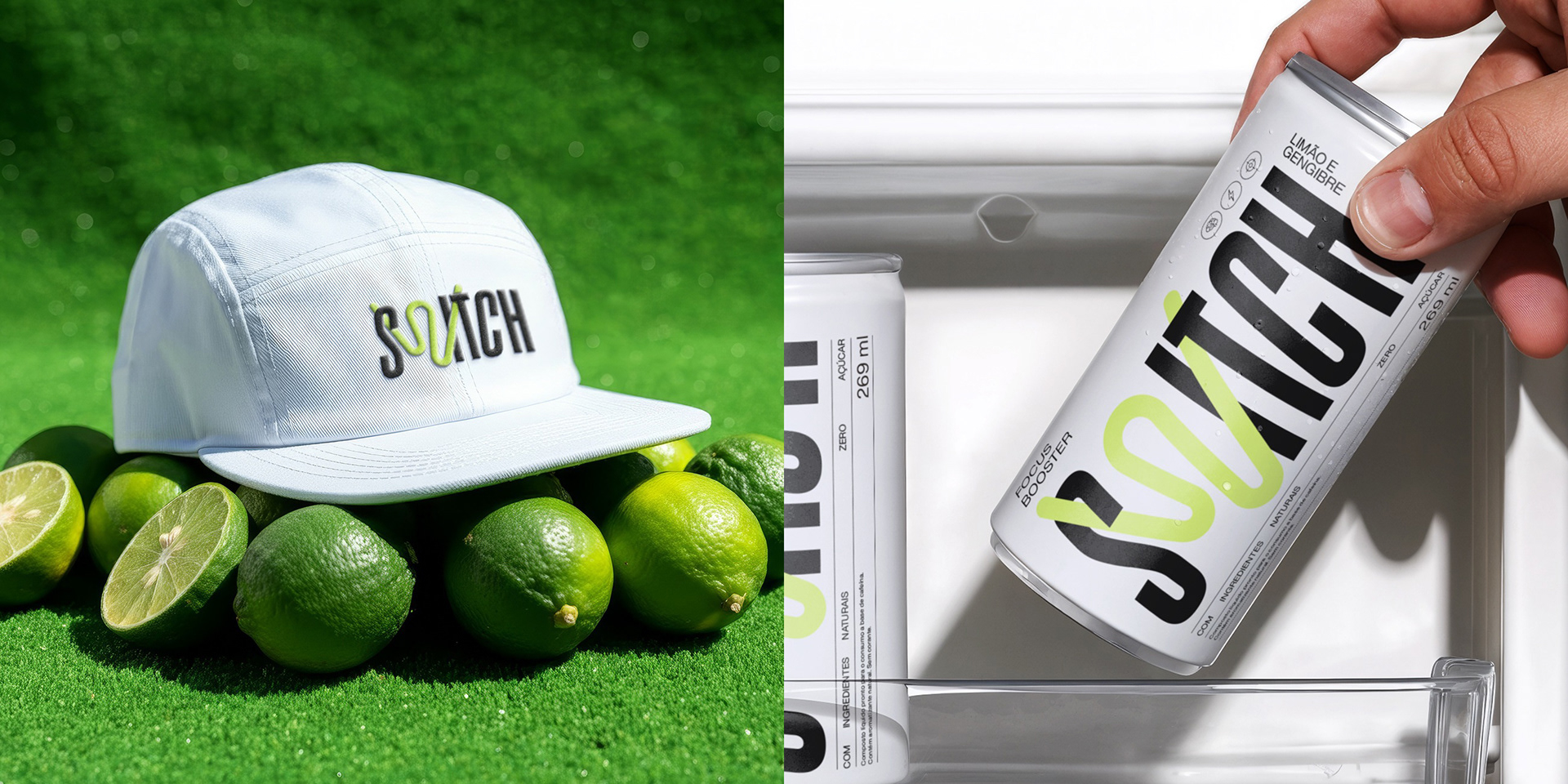
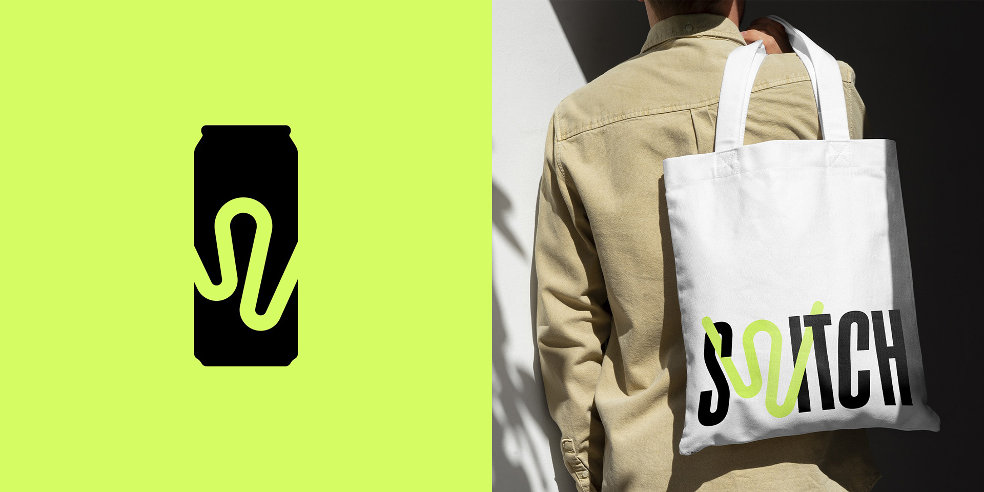
Branding, Naming & Packaging
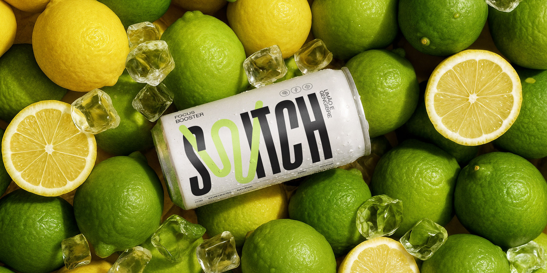
Switch is the natural and smart answer for those always on the move. With a 100% natural formula, the new energy drink boosts focus and mental performance in a more mindful way.
Challenge
Break away from the clichéd narratives and aesthetics of conventional energy drinks through the creation of a branding platform and packaging, covering naming, verbal identity, and visual identity.

Solution
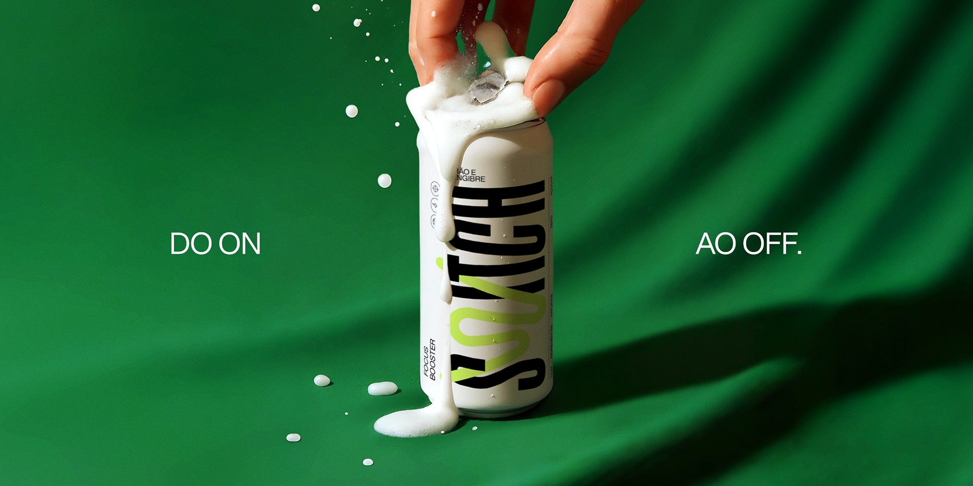
Inspired by the product’s simple yet powerful proposition, we developed a brand that resonates with these core pillars. The name itself translates the drink’s effect of shifting the consumer’s mental and emotional state: from distraction to focus, from fatigue to vitality. Beyond its meaning, the name also carries the sound of a can opening, marking the moment of change.
The verbal identity takes this concept further, with a vocabulary and expressions that play with activating, switching on/off, exchanging, and more. But the verbal identity does more than reinforce this narrative - it provokes and positions Switch as the brand for those who think differently and have already turned the key to well-being.
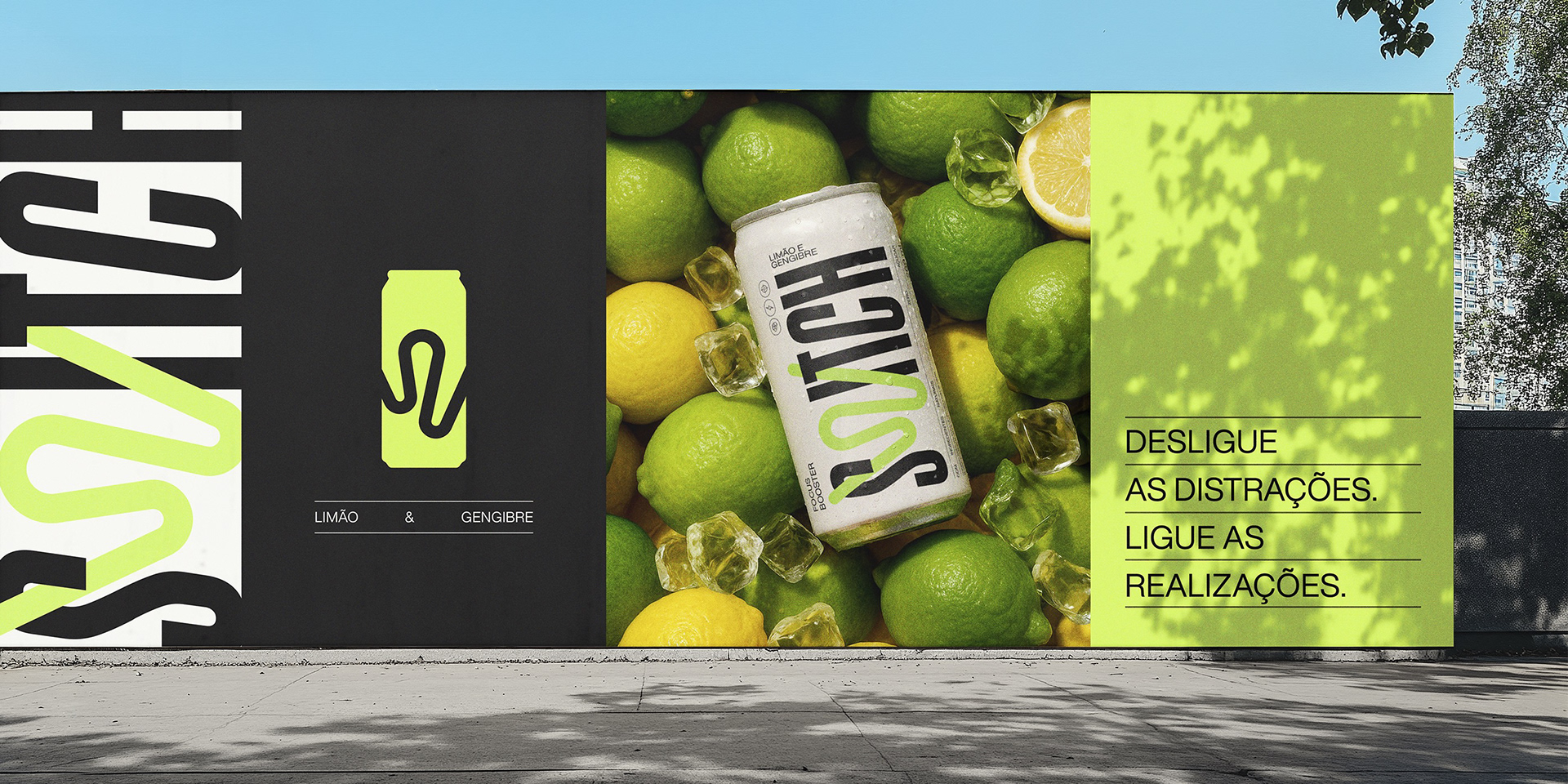
Meanwhile, the visual identity gives form to this story with a language that provokes without abandoning minimalism, combining movement and vitality in a light design that stands out both digitally and on the shelf.
The organic stroke of the “W” represents the flow state, symbolizing focus, balance, and transformation. A simple way to translate the product’s benefits, also echoed by the palette: white brings lightness, while neon green expresses energy.Thus, name, verbal identity, visual identity, and packaging design come together to reflect the brand’s purpose - delivering energy with fluidity.